Art Studios, where Brutalist is... Fine, Really
As I am writing this, the Town of Ladysmith BC has declared that they are cancelling all tenders for the project (link). I'm compelled to write, all the same.
A lot of energy gets inserted into Facebook, and especially so for smaller towns. One of the draws of social media is that it's very easy to say what one thinks at a given moment, without pause or filter. When you finish any sentence, that "ctrl-enter"-combination is such an alluring draw, that it often gets the better of me. It got the better of many a person.
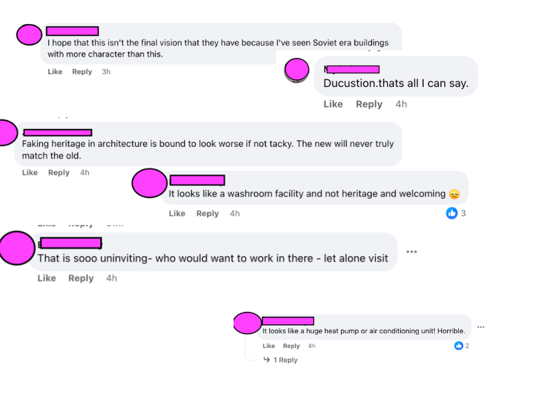
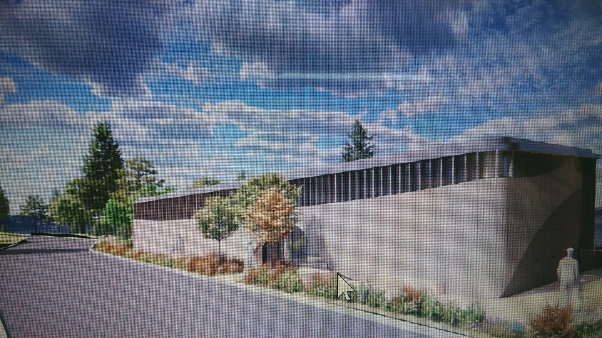
The subject of this invective centers around a proposed replacement artist studio at the Ladysmith waterfront. The old studio at the railyard has to be somewhere else. A fair bit of consultation between key stakeholders has gone into a new design and the public response from the usual corners has been harsh. "Soviet", "Ugly", "Uninviting". This is the common set of arguments from those who give reason to speak to the single photo that has been provided by the town on the design.
I think that they're wrong. Not becuase it's not ugly (I see in this concept an example of Pacific-inspired brutalist architecture that might hold inspiration from First Nation, Japanese, and Scottish minds alike), but because to be a good artist studio, it must present itself as a barrier between worlds.
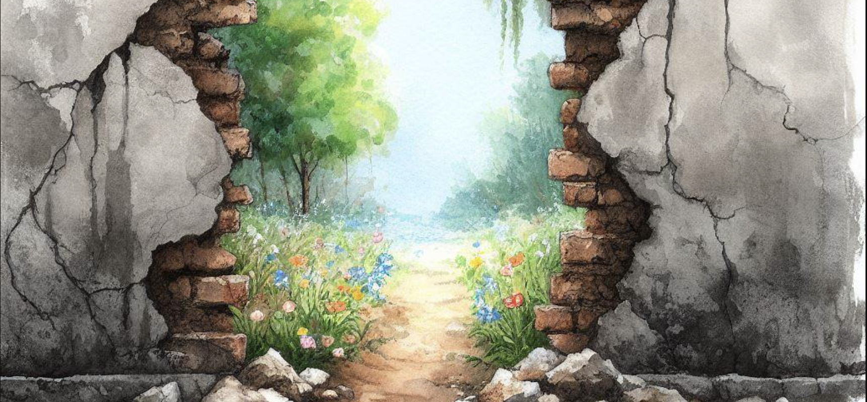
Successful artist studios generally follow a pattern. You can find them in unassuming builidngs in former industrial sites, and you can find them in isolated places. Beyond the practicalities of affordability, there is a secondary reason for this: An effective artist's studio is a wall.
When done right, a successful studio separates the real from the mythical. The present from the timeless. It cleanses our pallete of our biases and assumptions as we step from our world into that of the artist.
The mind of an artist is different than the mind of a normal person. Their creative spark generally sends them to places that most humans dare not tread. Many of them live in a world that is more mythos than reality. It's a realm that's separate completely from our own, and the wall for this artist lives in their mind.
For the rest of us, when the artist is effective at presenting their world, the wall is more material. When we walk through to a display of what the artist has worked on, often we transport ourselves from our world into this place of limbo. Time stands still, as we gradually shed familiarity for the unknown. Part of that experience when we go to a show often involves us passing through a physical medium or barrier. And the facade of the building can have a great deal to do with this.
Many a successful studio is desiged by accident to be unassuming. They're often hard to find or notice, or present a locale we usually don't desire to visit. Under the cover of banality, they are almost guaranteed never to outshine both the world you come from and the world that lies within.
Back to the Ladysmith Studio
That is sooo uninviting – who would want to work there – let alone visit
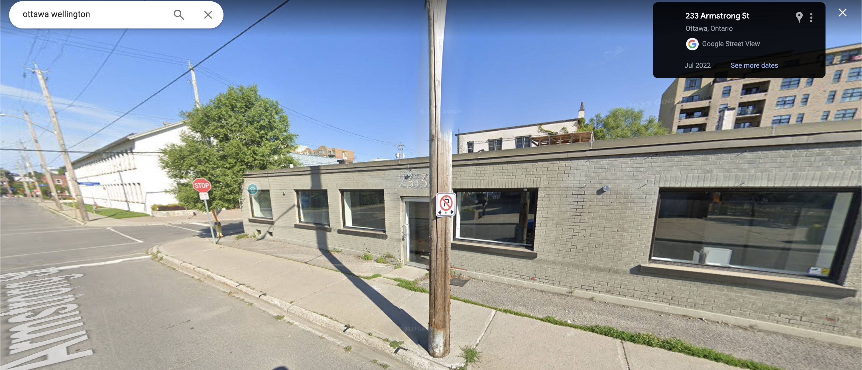
The Ladysmith Studio project was created out of a need. Before its end, the existing studio took the form of an old railyard building.

It worked for a time. But it does not now, so a new studio must be built, and this is the building that the architects and artisans seem to think is the best idea at this moment:

This studio is a wall between your world and the artist's. It separates the world of the real from the world of the mythological. It isolates the resident artists, as it is "uninviting" at first glance. You will not want to visit here. But it is a place where an artist can slowly build their own world. And when they do, it will become a place you want to visit.
The design is fine.